Two Seconds to Click: How Your Thumbnail Edit Is the Most Important Shot You'll Ever Take
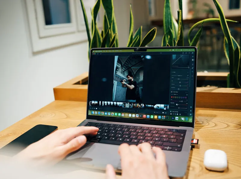
You've spent three hours on a shoot. Another two in Lightroom. You've nailed the color grade, the crop is perfect, and the final gallery looks genuinely stunning. Then you upload it — and crickets.
Here's the uncomfortable truth: nobody got far enough to see how good your work is. They bounced at the thumbnail.
In the current content economy, your preview image isn't a formality. It's a tollbooth. And if it doesn't collect attention in roughly two seconds, the rest of your work might as well not exist. Welcome to what some creators are calling the thumbnail economy — where micro-edits and split-second visual decisions have more impact on your reach than almost anything else in your workflow.
The Two-Second Rule Is Real (and the Data Backs It Up)
Eye-tracking research from Nielsen Norman Group has consistently shown that users make snap judgments about visual content in under 200 milliseconds. On social platforms, that window stretches slightly — but not by much. Creators and photographers operating on YouTube, Instagram, and even Behance are working with an average viewer attention span at the scroll level of about 1.7 to 2.3 seconds.
MIT neuroscientists found that the human brain can process entire images in as little as 13 milliseconds. That means by the time your viewer consciously registers your thumbnail, their brain has already voted.
The implication for photographers? Your editing workflow needs a dedicated thumbnail pass — a distinct, intentional step that treats your preview image as its own creative deliverable, not just a cropped version of whatever looked good in the full set.
Why Most Photographers Are Getting This Wrong
The default behavior for most shooters is to auto-select the first strong image from a set, export it at a lower resolution, and call it done. That's a workflow optimized for speed in the wrong direction — you're rushing the one edit that gets seen first.
The bigger mistake is editing thumbnails the same way you edit final images. Full-resolution portfolio work rewards subtlety. Thumbnails punish it. Nuanced shadows, delicate skin tones, and gentle vignettes that look gorgeous at full size become visual noise at 320 pixels wide.
Effective thumbnail editing is a different discipline. It's louder, faster, and more aggressive — and it needs to be approached that way deliberately.
The Micro-Edit Stack That Actually Drives Clicks
Here's what the data and high-performing creators consistently point to as the variables that move click-through rate (CTR) at the thumbnail level:
Contrast Over Color
Color grading is your full-image signature. Contrast is your thumbnail weapon. A quick +20 to +30 bump in contrast, a slight lift in clarity, and a deliberate crush of the blacks will make your image pop on any background — whether it's a white Instagram feed or a dark YouTube sidebar. Test it: pull up your thumbnail at 10% zoom. If it still reads clearly, you're in good shape.
Faces and Eyes Win Every Time
Studies on visual attention consistently show that human faces — especially eyes — attract gaze faster than any other compositional element. If your shot includes a subject's face, crop your thumbnail to prioritize it. Even if the full image is a wide environmental portrait, your thumbnail version should be tighter. Don't be afraid to create a separate crop specifically for preview use.
One Visual Anchor, No Exceptions
Busy thumbnails lose. The scroll environment is already chaotic, and a visually complex preview image reads as noise rather than content. Identify the single most arresting element in your frame — a face, a color block, a dramatic light source — and edit toward it. Darken competing elements. Simplify the background in post if you have to. Your thumbnail should have one job: make the viewer want more.
Saturation Is a Dial, Not a Checkbox
A modest saturation boost — somewhere between +15 and +25 depending on the image — can dramatically increase visual pop at small sizes without tipping into garish territory. The key is selective saturation. Use HSL controls to push your hero color (the dominant hue in the frame) while leaving skin tones and neutrals relatively untouched. This creates vibrancy without the oversaturated look that signals low-effort editing to savvy viewers.
Platform Context Changes Everything
A thumbnail that crushes it on YouTube might flatline on Instagram. Platform context matters enormously, and your micro-edit decisions should reflect where the image is landing.
YouTube rewards high contrast, bold text overlays (if you're a hybrid creator), and strong facial expressions. Thumbnails compete in a sidebar or grid where the background is typically dark gray or white.
Instagram serves thumbnails in a 1:1 or 4:5 grid, often surrounded by similarly edited content. Here, a distinctive color palette or unexpected composition does more work than raw contrast.
Pinterest is vertically oriented and rewards rich, warm tones with clear subject matter. Lifestyle and product photographers should consider a slightly warmer grade on Pinterest-specific previews.
Behance and portfolio sites have more patient audiences, but your hero image on a project page still needs to earn the scroll. Clean, high-contrast reads with clear subject focus outperform moody, complex compositions in first-impression testing.
If you're distributing across multiple platforms — and most working photographers are — consider building a thumbnail variant into your export workflow for each destination. It sounds like more work, but we're talking about edits that take under three minutes per image when you build the muscle memory.
Build a Thumbnail Edit Preset (And Actually Use It)
One of the fastest ways to level up your thumbnail game without adding significant time to your workflow is to build a dedicated preset in whatever editing tool you're working in. Most Lightroom and Capture One users have presets for their signature look — but almost nobody has a thumbnail-specific preset.
Start with your base edit, then layer in: +25 contrast, +15 clarity, +20 saturation on your key hue, slight shadow crush, and a very subtle sharpening boost. Save that as a one-click starting point for every thumbnail pass. From there, you're doing minor adjustments rather than building from scratch.
Combine that with a batch export action set to your platform's optimal thumbnail dimensions, and you've got a thumbnail workflow that adds maybe five minutes to your overall session — in exchange for meaningfully higher click-through rates on everything you publish.
The Fastest Edit Is the One That Gets Clicked
At PhotoRush, we talk a lot about speed — because in this industry, turnaround time is currency. But speed without strategy is just noise. The thumbnail economy rewards photographers who move fast and move smart.
Your two-second window isn't a limitation. It's a lever. Pull it deliberately, and you'll find that the images that used to get buried start getting found — and the work you put into every frame finally gets the audience it deserves.
Edit fast. But edit your thumbnails first.